NuoDB Overview Graphs
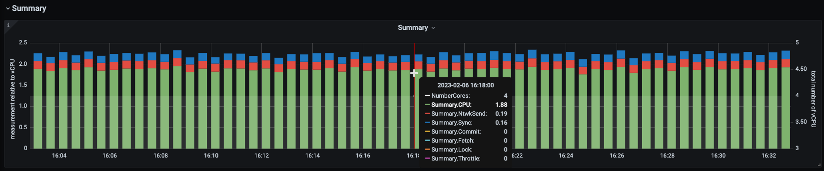
Summary Graph
This stacked column chart displays the proportion of summary time spent in various high-level operations for Transaction Engines (TEs) only.
Transactions Graph
The green line graph plots the number of commits. The red bar graph displays the number of active transactions. The blue line graph plots the average time to complete the SQL statements.
The pop-up window that appears on hover displays the number of commits (commits), the number of active transactions (active:current:), and the average time taken to complete the SQL statement (processing:average:).
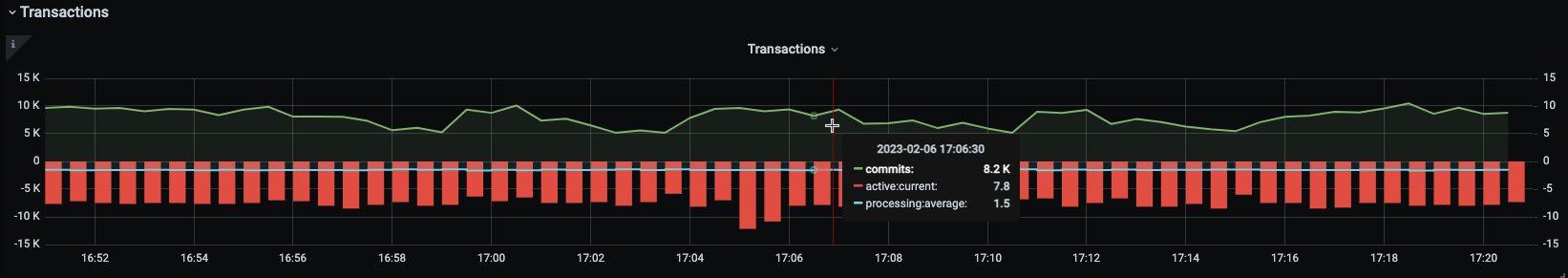
| The time to complete a SQL statement is displayed only after the statement is executed. |
Use Case
Using the history of workload, understand where peaks and troughs of database activity may be. A study of this graph, along with others, may be used to locate the application inefficiencies and to review the location of hardware resources to maintain optimum performance.
Graph Creation Details
To create a graph using other tools, use the following details:
-
Commits: commits per second: For the rate of the number of
Commitsfrom each TE, sum all commits from each TE. -
Active: number of active transactions: For the number of raw
CurrentActiveTransactionsacross all TEs, sum all current active transactions from each TE. -
Processing: SQL statement process time: For the value of time taken for any returned SQL
SqlListenerSqlProcTimefor all TEs, average.
Workload Graph
Stacked column graph with the green column indicating transaction idle time waiting for a client (green) as a fraction of the red column indicating SQL statement time (red), based on a 100% stacked ratio.
| Observe the range of percentages on the Y-axis. |
The pop-up window that appears on hover displays the percentage of time used for the execution of the SQL statement (Busy) and the percentage of transaction idle time waiting for a client (Idle).
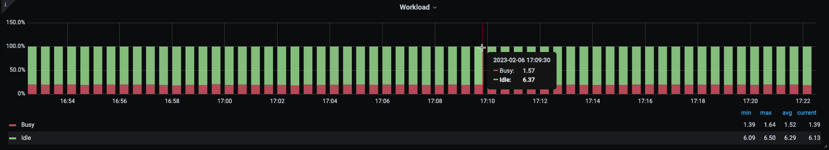
Use Case
Using the history of workload, this graph can be used to understand the locations of peaks and troughs of database activity.
A higher Transaction idle time (Idle) indicated by larger green columns, may indicate that the application is not efficient at keeping the database busy during a transaction or that the transaction is held open for longer than necessary.
A higher time to execute the SQL statement (Busy), indicated by larger red columns, may indicate that the DB is well utilized in a transaction or that the DB is a bottleneck for the application.
Short transactions are likely to have larger red columns as they are mostly DB time.